Allan Deviation Guide
Introduction
Allan deviation lets you view noise within a signal over time. Usually the values of Allan deviation are displayed on a log-log graph. You may have seen these graphs, and you may have had one or more of the following questions:
- How are these graphs made?
- How can the graphs help me choose between products?
- What are these graphs used for when I am using my product?
These are the topics that this guide covers.
Although Allan deviation is one common way to quantify noise, it certainly not the only way, even within its speciality of separating different types of noise. Analyzing an actual real 'signal', and separating your data from noise and error is a complex and often custom process. Allan deviation graphs give an idea of how well - given ideal conditions - noise correction could be achieved. In particular, it is a measure of frequency stability - or how consistently close to total noise corrections you can get.
We begin by walking through the basics of sensor noise at a very high level. With this knowledge of noise, we discuss what an Allan deviation graph means and how to use the data in both your decisions for purchasing a product, as well as correcting noise from the sensors when using the product.
To be able to collect and analyse your own data for characterizing noise, we include code for the statistical analysis program R, which is freely available and works on most major operating systems (Windows, macOS, Linux).
Signals, Noise, and Data
Let's start with an example: We have a sensor - be it an accelerometer, or temperature sensor, or light sensor, etc. - with which we are taking measurements many times per second. This stream of measurements is our 'signal'.
Each data point in a signal is a combination of actual, real measurement, noise, inteference, drift, bias, and so on. If we take only one point out of our signal, away from the context of the other points and any knowledge we have about the sensor, we have absolutely no way to know what part of the signal is noise, what part is data, and what part is everything else.
Noise
There is one universal characteristic of noise: Over enough time, noise averages to zero
This is sort of a pure definition, but it will serve us for now. If this is not true, that portion of the signal is not 'noise', it is something else. It may be interference of some kind. It may be an offset in the sensor. It may, in fact, be the data you actually want to measure! Parts of a signal which are not noise, and which are not actual data, are usually called 'error'. In a real-world stream of data (i.e. a signal), all of these and other factors combine to create the values that the sensor gives you. To see why this mental model is useful, we will use the example of an accelerometer.
Let's say we know that our accelerometer has a noise level of 10mg. And let's say we get a single data point measurement from the accelerometer which reads "1.052g". For the moment, let's make the further (and wildly incorrect) assumption that the only two components of the data are:
- real data
- noise
Even then, we can't correct for the noise very well using this single point. First of all, the noise level is generally the 'maximum' noise. This means noise will be up to about 0.01g away from the real data value, but its magnitude may also be less. Even if we assume that the noise is always 0.01g, does the noise on this particular data point go up or down? In other words, is our measurement actually 1.062 or 1.042? There is no way to know.
We need more data. So let's look at the next point. Say it's 1.059. The next is 1.061. Then 1.057. If it feels we're sneaking up on an answer, then you can see why the definition of noise averaging to zero actually fits with your intuition. You may be saying now: Just get enough points and average them, and if our accelerometer doesn't move then that average will be really, really close to the right answer. And this is the aspect of noise that we can use: averaging over time, eventually, averages the noise to zero by the very nature of what noise is.
Measuring Noise
So how do we get this really, really accurate measurement? Well, we take a lot of points. A lot of points, just for one measurement.
In the case of our accelerometer, the accelerometer should not be moving. So we anchor our accelerometer to a desk that won't be touched for a while, and start saving the data it records. This setup gives us nearly constant acceleration, from gravity (an equivalent setup could be imagined for having a constant temperature for a temperature sensor, or a constant amount of lux for a light sensor - though gravity is relatively easy to keep constant). After a lot of points like this - let's say about two million - if you plot one of the two axes not aligned with gravity (e.g. usually X or Y) your data might look like this:
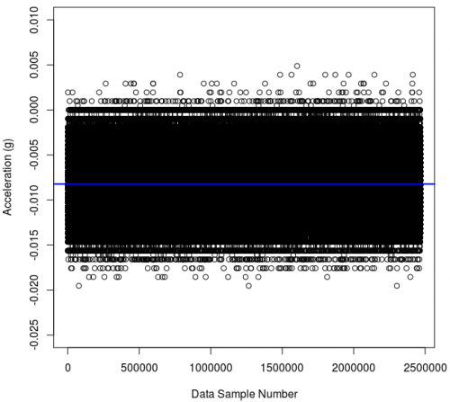
You can see that we don't just get the same exact value over and over and over - we get a range of values within a relatively thin spread. If we average all of these values, we get the value along the blue line. It is a bit off of zero, at -0.008. This may be an accuracy problem (feel free to find information on the Internet for the definitions of accuracy, and precision when it comes to data). But much more likely (as this sensor has been calibrated) is that the accelerometer is at a slight tilt with respect to the vector of Earth's gravity and is therefore feeling a bit of the pull.
This sensor has a noise level of 10 mg and indeed you can see almost all of the spread is contained within 0.01g to either side of the blue average line.
You can plot this easily in R. Assuming that you have a data.csv (comma-separated values) text file with all of your logged accelerometer data that looks something like this:
Time,AccX,AccY,AccZ
1.279,0.00843,0.00569,1.0240
1.280,0.00947,0.00592,1.0301
1.281,0.00853,0.00621,1.0278
........
You can import the data and plot the X-axis and the X-axis average as above on the R command line like this:
data <- read.csv("data.csv",header=T)
plot(data$AccX,xlab="Data Sample Number",ylab="Acceleration (g)")
abline(h=mean(data$AccX),col="blue",lwd="2")
Note: Make sure the data.csv file is in the folder you started R in for that to work.
But - you're probably thinking already - this only works if we don't actually want to measure any changing data. And you probably didn't buy an accelerometer just to measure the force of gravity. You actually want it to move - to measure things on a realistic time frame. To do this, we need to characterize how the noise acts over time, so we can find out how long to accumulate data before being able to correct for noise.
Allan Variance
One way to do this characterization of your sensor is to measure how much it varies over time. And then - and here's the trick - you measure how much that variance varies. That isn't too clear without an example, so let's take those same two and a half million points from above. With them, we can find out how well we can measure what the noise actually looks like, and how that noise changes based on how long we measure it.
Note that this method makes a weighty assumption. The assumption is this: what you find out is a characteristic of your sensor, not of the particular data set we're about to collect. With this assumption, we can characterize a sensor, and then use the equations and values from that analysis to, in turn, clean up noise from new data. So it is important to characterize your sensor in the same conditions that it will be used in, for reasons we go in-depth into later on.
For many sensors, there is an ideal length of time over which you can take an average (or other statistical measure) and obtain a value with the least possible noise (at least for some types of noise). With our example of 2.5 million points above, we can ask the question: how many points do we need to average before we get to our expected value of -0.008? This is a good question, but unfortunately for an incoming data set we don't know the -0.008 'answer' until we get a lot of points.
So we use another measure of precision, which is variance. Simply, this is the amount that a data set is spread out. A group of numbers (1, 2, 10) has less variance than a group (1, 2, 100). To see why variance helps us, mentally split the 2.5 million points in half. Average the first half. What value do you get? Probably -0.008. Now average the second half. What value do you get there? Again, probably -0.008. So the variance between the first half average (-0.008) and the second half average (-0.008) is essentially zero - because they are the same number.
Now let's say instead of two groups of 1.25 million points, you treat each individual data point as a 'group'. That is, we now have 2.5 million groups. In this case we do the same thing - we 'average' each group (in this case this is only one number, so that's easy) and then examine the variance between all the group averages. Here, we also know the answer of how much the group averages are spread out - we saw it in the graph above. When treating each individual point as a 'group', the variance of the group averages is equal to the sensor noise, or about 0.01g on either side (0.02g total) in the case of the sensor we used.
So somewhere between these extremes - the 1.25 million point groups, and the single point groups - we have a 'happy medium' balance. This happy medium is the smallest number of points we need to collect to minimize the variance in the group average (i.e. get each group really, really close to -0.008), but not so small that the average swings wildly like the noise does on each sample.
Finding Allan variance is finding that happy medium.
To do this, we don't just have groups of one or 1.25 million, we want to try all the group sizes. So, we can go through the whole data set, and split it up into 2 data point chunks, and average them each individually. Then 3,4,5....10....100....1000-data point chunks, and average those individually. Then, we find the variance between all of those data chunks of an equal size.
As groups of data get longer and longer, the averages between different chunks of data should become smaller and smaller - because the average of each chunk should be closer and closer to the 'real' average.
Calculation
Luckily, in R, there is already a library that can do Allan variance for us. This library is called allanvar, and its documentation and source is available online. If you've not installed a library into R before, there is documentation on that too.
Within R, on the command line, we can:
- Find the length (end) of the data array,
- Use that length to find the average time step between samples and save its inverse as the frequency,
- Use the X-axis data and the frequency to obtain an Allan variance array
After our data.csv import above, this looks like:
end <- length(data$Time)
frequency <- 1/mean(data$Time[2:end]-data$Time[1:(end-1)])
library("allanvar")
avar.data.x <- avar(data$AccX,frequency)
The avar function is actually what calculates the Allan variance for us. This stores the variance in the av slot, the time chunk length for that variance in the time slot, and the error on the measurement in the error slot.
Then we plot the this variance value for each chunk size, using something like this:
plot(avar.data.x$time,avar.data.x$av,type="l",col="green",xlab="Sample Time (seconds, at 50 samples/sec)",ylab=expression(paste("Allan variance (", gravities^2,")")))
And we find this plot:
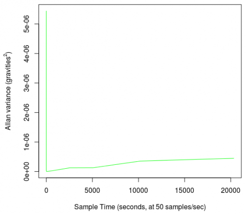
This graph shows what we expect (i.e. that there is indeed a very obvious point where averaging a big enough group of data plummets the variance from the noise level to a much smaller number). However, it is not a very useful graph, for two reasons:
- The change happens so suddenly that it is difficult to tell what the ideal group size is, and
- The units of variance are the sensor value squared, and 'gravities squared' is not a very intuitive unit.
There is also the curious fact that the variance, after dropping, seems to rise again, a state that we talk about later on.
Log-Log Modification
For now, though, we can fix the first problem by placing the data on a log-log plot. The reason why the drop is so sharp is that it drops several orders of magnitude in a short horizontal space. Thus, a log-log plot will give more weight to smaller numbers than larger numbers and accentuate changes. We modify the plot command like this (note the addition of log="xy") and we also use the options() function to prevent the use of "1e00" notation up to 5 decimal places:
options(scipen=5)
plot(avar.data.x$time,avar.data.x$av,type="l",col="green",log="xy",xlab="Sample Time (seconds, at 50 samples/sec)",ylab=expression(paste("Allan variance (", gravities^2,")")))
These commands give a plot like this:
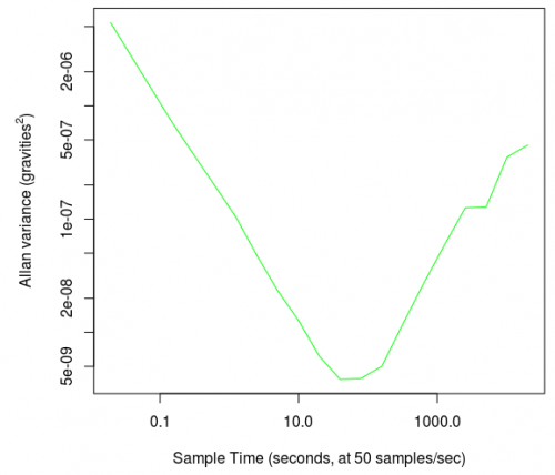
The big, several-orders-of-magnitude drop now appears as a nice, sloping line that has a clear minimum at around 100 (which is halfway between 10 and 1000 on a log-log plot). At 50 samples per second, this means that the variance dropped to a minimum when a sample size of 50 x 100 = 5,000 samples are averaged.
The secondary increase in variance in our first, linear graph now appears as a significant turn back up on the log-log plot. This is even though on the linear graph it is accurately portrayed as only a slight upward trend when compared numerically to the initial noise reduction.
Allan Deviation
The log-log plot modification only solves one of the two problems described in the Calculation section. The other problem - that variance has units of 'squared' prevents us from interpreting the values that the log-log plot curve reaches.
To solve this, we can use Allan Deviation rather than Allan Variance. Standard deviation is the square root of variance. So to get Allan deviation from Allan variance, we just take the square root of every variance measure we calculated above. This sets the units back to ones that we can intuitively understand (i.e. the same units the sensor actually records - gravity equivalents).
However, standard deviation is a bit harder to envision in meaning than variance. Whereas variance is the whole spread of a collection of data, a standard deviation is only the closest 68% of the data to the mean. So, if our mean is 0, and our standard deviation is plus/minus 5, around 32 percent of that data set is greater than 5 and less than -5. So unlike variance, which tells you the highest and lowest extent, standard deviation tells you only where the majority of the data lies.
That said, the deviation graphs are easier to interpret at a glance.
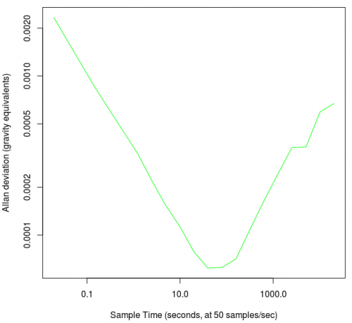
We can simply plot the square root of the Allan variance, and we have an Allan deviation graph. In R, the modification is using the sqrt() function:
options(scipen=5)
plot(avar.data.x$time,sqrt(avar.data.x$av),type="l",col="green",log="xy",xlab="Sample Time (seconds, at 50 samples/sec)",ylab="Allan deviation (gravity equivalents)")
This gives:
If you want to check out all three axes, you can and although the graph curve looks the same, the y-axis units have changed.
You can also spruce up these graphs a bit, using R's extra features, and you can add your other axes so you can get an idea of how much your data will just vary naturally (or you could print your error bars too). For example, this:
options(scipen=5)
plot(avar.data.z$time, sqrt(avar.data.z$av), log="xy", type="l", col="green", xlab="", ylab="")
lines(avar.data.y$time, sqrt(avar.data.y$av), col="red")
lines(avar.data.x$time, sqrt(avar.data.x$av), col="blue")
grid(equilogs=TRUE, lwd=1, col="orange")
legend("topright", c("Accelerometer X Axis","Accelerometer Y Axis","Accelerometer Z Axis"), fill=c("blue","red","green"))
title(main="", xlab="Cluster Time (Sec)", ylab="Allan Standard Devation")
...Gives you this (the familiar curve we've been working with is now the blue x-accelerometer-axis):
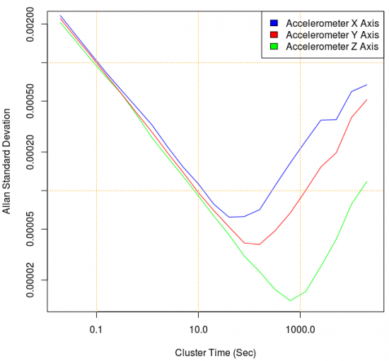
The use of Allan deviation allows us to actually use the values on the graph's Y-axis for interpretation, as we describe in using the graphs section.
Using The Graphs
When using the graphs for either comparing products or learning how to best use your sensor, it helps to split the graph up into four parts. There are other tutorials on how to interpret these graphs elsewhere on the internet. Some of these split Allan deviation graphs into even more parts, in order to separate the effects of different types of noise. For practical discussion here, we do not include many specifics on different types of noise.
The four parts of the graph we will discuss here are as follows:
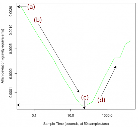
We discuss all four parts in-depth below, but briefly:
Point A - This y-axis value is the standard deviation of noise for any one single measurement point.
Point B - Averaging over the time spans along the decreasing slope corrects noise which oscillates quickly.
Point C - Eventually, you average enough that the fast-oscillating noise is mostly corrected for. This minimum has both an X and Y value of interest.
Point D - Noise which oscillates over longer time frames begins to influence bigger groups of averaged data.
Point A - Single Point Noise
The starting point of the graph is the standard deviation of noise for a single point. This makes sense as at the start of the graph, our 'group' size is one, and so the standard deviation of change from group to group will be equal to the standard deviation of the points individually. Hence, the starting Allan deviation and the standard deviation of your data set should be the same.
So, to partially confirm you did all the correct processing, you can find the standard deviation of your raw data. This is the same as treating every single data point as a 'group' of one, and so In R, the standard deviation can be found with sd():
> sd(data$AccX)
[1] 0.002505336
And this aligns with point (a) in the graph image above.
Note that this is true as long as the bias (drift) is not larger than the white noise. If bias drifts more over time than white noise produces on a short time, the standard deviation of a data set will measure bias, not white noise standard deviation.
Use in Choosing Products
When comparing products, this number is of interest for applications which need to average over as small a group as possible (i.e. they need to use absolutely every single data point that they can). For most applications, as described in the Noise section, it is useful to at least do some averaging, so you don't want to just take this value and run with it.
Practical Use
When using your sensor, this value is useful when trying to assess how much error from noise a single measurement point will have. Here, about 68% of our measurements will have noise error of 0.0025g, and 32% will have noise error greater than that. As also described in the Noise section, it's really impossible to tell whether noise on a single measurement is big, small, positive, or negative. So this is simply useful to compare to the numerical magnitude of measurements you expect to be getting, and whether noise error will be a significant portion of your data of interest.
Point B - Improvement From Averaging
As you can collect more and more samples and average them to a useful value, you can perform better and better corrections on the data.
Use in Choosing Products
To use the slope from the maximum at Point A to the bottom of the dip at Point C, you will need to think about your application. How long can you reasonable sample and average for? Do you want noisy readings once per tenth of a second, or less noisy readings once per second? If your project is trying to measure very small signals relative to the noise in the Allan deviation graph, you will want to compare graphs for products at the timeframe you will be working with.
Practical Use
Being able to vary the amount of noise reduction per unit time available to characterize the signal can let you fine-tune your application's sampling strategy.
This may be useful, for example, in a quadcopter where you want to smooth the jumpiness of an accelerometer as it helps you estimate position between GPS readings. For accelerations which are large relative to the noise on the graph's Y-axis, averaging may smooth those values a little bit but not prevent their detection. Hence, you could filter noise more effectively the more samples you can gather as long as your data of interest are large enough in value and long enough in time to not be affected much. This bias modelling - by averaging - allows you to move down along the slope toward the minimum.
This would not be useful, however, for measuring vibrations that oscillate faster than one per sampling width.
Point C - Best Case Bias
In theory, this minimum bias is the best case error on the sensor. Practically, even this may be a difficult level to reach. To reach it, you would have to have data coming in at a rate approximately equal to the X-axis value of this minimum Point C. This demands a very specific application and sampling strategy.
In the case of the sensor we're using here, this would be about once per 100 seconds, at 50 samples per second. This may seem like a lot, but remember that your measurements may be very large related to the expected noise well before 100 seconds (as described above in the Point B section) and so even some reduction along the Point B line will help, even if you're not right at the minimum.
Remember that this is the standard deviation of noise, so about a third of the points, even characterized to Point C, will have noise greater than the minimum displayed in the graph.
Use in Choosing Products
This minimum on an Allan deviation graph is the most often used data point to compare sensors. This is despite the fact that all points on the graph have value when choosing a product. The use of this data point is to show you the best case you can get. Even if you can choose your sampling support time, and you have lots of leeway with what kind of sensitivity you need (averaging greatly reduces your available sensitivity), your data will still have bias around the size of the minimum at C.
Hence, if you have a very flexible application, but need the least sensor bias possible, the standard deviation (Y-axis value) at Point C is the point of interest for you. You will want to choose the product which has the lowest bias.
Point D - Low Frequency Noise
When you take only a small group of values within this low frequency noise - such as random walk noise - the numerical change is quite small. Over a larger and larger group of data, this random walk noise can be quite large numerically. This noise is usually the sum of multiple factors, including temperature effect, vibrational noise, and random walk.
Like other noise, truly random walk noise will eventually average out to zero. However, you would have to collect data over a really, really long time. Long enough that any random walk noise, of any reasonable repeat frequency, would be captured by your data. But imagine - let's say you find that the new minimum noise point is over tens of thousands of seconds of averaging - do you really want to average your data for that long to determine bias? You'd miss all of your actual, real, fast data coming in from your sensor because you'd have these long-running averages all the time.
You can also see, when you examine the error slot in the R Allan deviation data (e.g. the avar.data.x$error variable), that expected error increases the more time you spend averaging.
Use in Choosing Products
This section of the plot is still very important to compare, even if you're averaging at a point earlier in the curve. This is due to the fact that you will still experience low frequency noise in the form of random walk or temperature dependence regardless of the averaging period. Imagine a set of 1000 data points whose median value slowly drifts over the course of the set. If you average together every tenth data point, you might mitigate most of the white noise, but the data will still drift the same amount as before.
Low frequency noise can sometimes be filtered and manipulated away in software if you have a very clear understanding of your sensor and the data that's being gathered, but this is very difficult and can only be done on a case-by-case basis. Choosing a sensor with a shallow low-frequency noise curve will be valuable if such manipulation is not viable in your application. You'll find that the low-frequency noise profile of a sensor is directly tied to the cost of the sensor.
Temperature Effects
When any electronic system is subject to changing temperature, it experiences some amount of change in error, which is then reflected in the noise characteristics. These temperature effects are not immediately obvious when looking at the accelerometer data over time, like within the graph in the Measuring Noise section.
But temperature effects and other, minor, difficult-to-control effects are what make inertial navigation so extremely difficult. If you were to record the Allan Deviation plot for an accelerometer at constant room temperature, your low-frequency noise characteristics (point D on the curve) may not be very steep. However, if you take the same accelerometer and put it in a dynamic-temperature environment, you'll find that the low-frequency noise profile will become much steeper. By comparing these two Allan Deviation plots, and keeping all other variables constant, you can determine roughly how great the temperature effect of your device is.