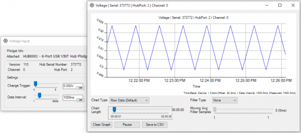
Control Panel Graphing
In the Windows version of the Phidget Control Panel, open the channel for your device and click on the ![]() icon next to the data type that you want to plot. This will open up a new window:
icon next to the data type that you want to plot. This will open up a new window:
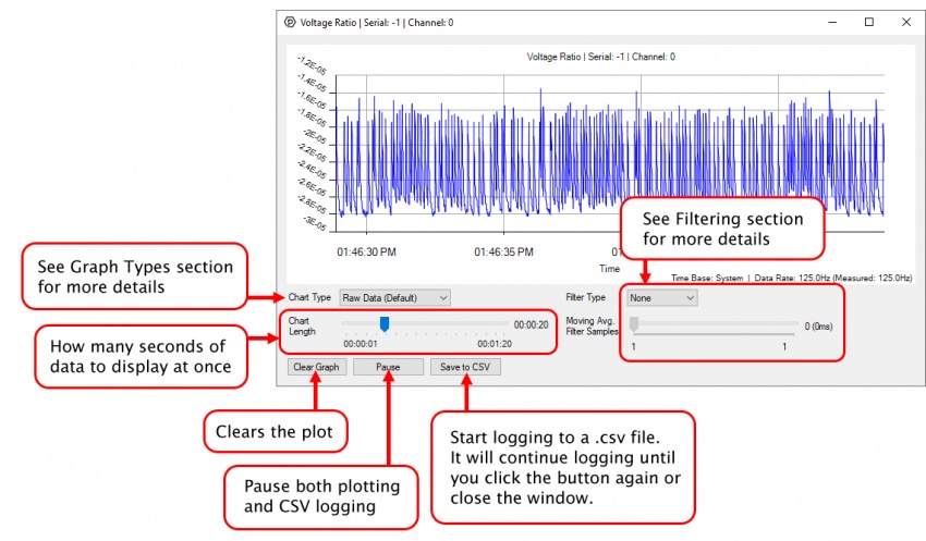
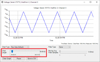
Raw Data Graph
The default graph is the Raw Data graph. This graph displays the readings from your sensor over time. This can be very helpful in visualizing sensor data in a much more concrete way than just reading numbers from the Control Panel Example.
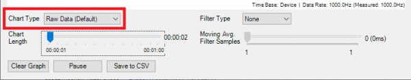
Chart Length
You can adjust the amount of time displayed on your graph by adjusting the Chart Length slider. This can be helpful for setting up your graph to display data on timescales you are most interested in.
Longer Graphs
If you want to monitor a sensor over a period of hours using the Phidget Control Panel Graphing tool, you can do so by slowing down the Data Interval of your device, which will increase the amount of time that you can display on the graph.
Filtering
You can perform filtering on the raw data in order to reduce noise in your graph.
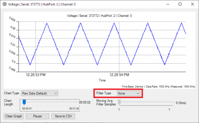
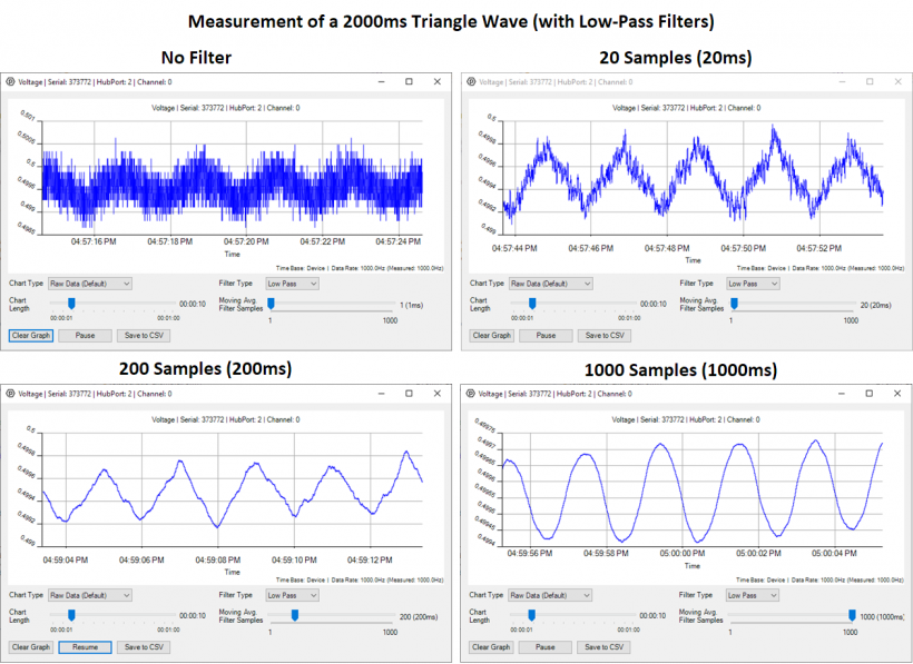
Low-Pass Filter
This filter reduces and removes high frequency components of the graphed data. It's generally used to smooth out your graph, since high-frequency noise can make a graph harder to read. Select "Low Pass Filter" from the drop down menu and move the slider to select the averaging window. The larger the averaging window, the smoother the line will be.
Note that if your filter is comparable to or longer than the period of the signal you are trying to measure, you will start to filter out the data you want along with the noise.
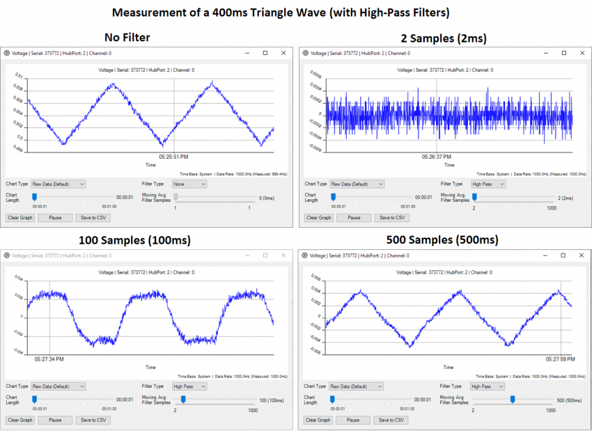
High-Pass Filter
Unlike the low-pass filter, this filter is used specifically to look at the high-frequency components of your signal. This can be used on very short timescales to characterize the high-frequency noise in the system, or it can be used over longer timescales to remove offsets to more easily gauge the scale of periodic signals. As a rule of thumb, be sure the time on the filter is longer than the period of the signal you are interested in, or you will see distortions.
Select "High Pass Filter" from the drop down menu to remove low-frequencies and offsets from your data.
Other Chart Types
You can change the Chart Type selection to apply transforms to the data that may provide further insights into your sensor data.
Fast Fourier Transform (FFT)
The FFT graph type will transform your data into a frequency plot, which can sometimes reveal hidden information about your data. For example, if you look at this raw voltage data:
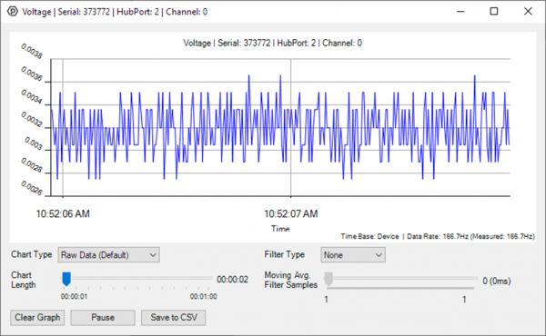
It's clear that there's just under 1mV of noise in the signal, but just from looking at the raw data it may be unclear where the noise is coming from; is it the sensor itself, or something external? Switching to the FFT plot gives us a clue:
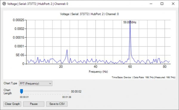
The FFT plot reveals that a significant fraction of the noise is coming from a 60Hz source; in this case, the signal wire was left disconnected and picking up noise from the power grid.
You can increase the graph length to sharpen the frequency spikes, just know this will take the graph longer to react to changes in the incoming data. In general, the FFT plot is most useful for analyzing sensor data where frequency has useful real-world implications, such as measuring vibrations of an accelerometer, or checking for 50/60Hz interference.
Allan Deviation
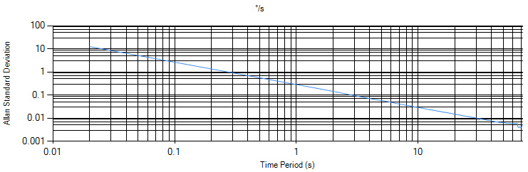
Allan Deviation is a very specialized type of graph used to compare noise characteristics between sensors. Interpreting the Allan Deviation plot is outside the scope of this guide, but in general your sensor should be stabilized (e.g. if it's a spatial, it should be stationary. If it's a temperature sensor, the ambient temperature should be kept at a static level).
More Complex Graphing
If you need more complex functionality such as logging multiple sensors to the same sheet or performing calculations on the data, you'll need to write your own program. This graphing tool is intended as a jumping-off point to better understand your sensors individually, so you can get a feel for how to use them in your applications.
The quickest way to get started is to download some sample code for your desired programming language and then search the internet for information on logging or plotting data in that language (e.g. "how to log to csv in python").